STYLE
GRID
- Grid introduction
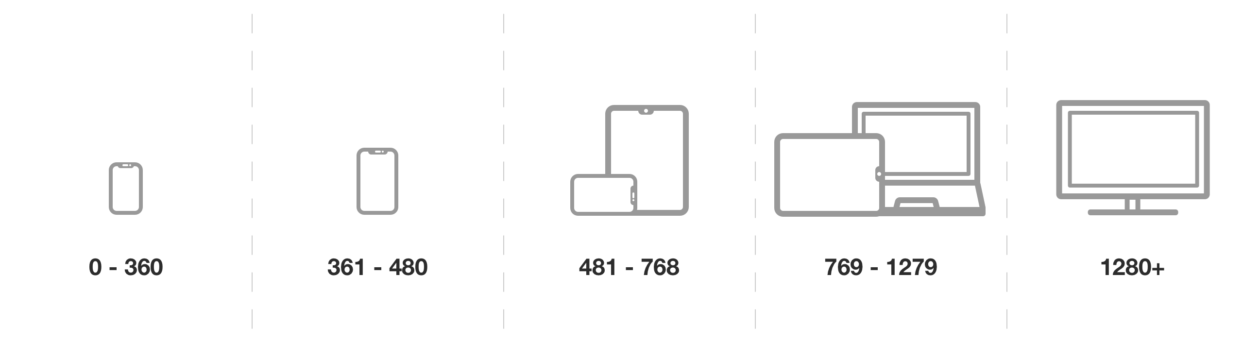
Breakpoints overview
- Spacing
ATOMS
MOLECULES
- Badges
- Form
- Data tables
- Alerts
- Progress bar
- Quantity widget
- Title header
- Search bar
- Search flyout
- Banners
- Product image
- Collapsible
- Coupon info
- Menu item
- Pictures menu
- Infospace
- Product rating
- Brushed text
- Product list item
- Product list empty
- Pills,skeleton
ORGANISMS
- Header
- Footer
- Pagination
- Product widget
- Product recommendations
- Product tech data
- Product info
- Product comparison
- Product relations
- Product buy box
- Product gallery
- Product usp
- Product history
- Menu
- Mobile header
- Category tree
- Featured product
- Eye catcher
- Product list
- Newsletter signup
- Main navigation
- Campaign card
- Full picture block
- Product highlight
- Voucher-code
- Header slider
- Primary campaign
- Campaign slider
- Featured categories
TEMPLATES
PAGES
DEVELOPER
Breakpoints overview
Under refactoring
This component is being refactored by a team or has potential to be refactored. Please check with frontend team before using it.
Fluid:
This is how it is implemented:
sm: 0 - 479px
md: 480 - 768px
lg: 769 - 959px
xl: 960 - 1329px
xxl: starting with 1330px
This is how it is in the design system(UX):
Responsive:
Here we create an overview over the different devices and breakpoints which are provided to make our website responsive.